Zazzle Design System
Project Overview: Elevating Zazzle's User Experience with a New Design System
This project aimed to establish a comprehensive Figma design system for Zazzle, seamlessly integrating with their newly refreshed brand identity. Our primary objectives were to foster a more scalable, delightful, and consistent user experience for Zazzle's customers and creators, while also streamlining the design-developer handoff process.
As the Senior Product Designer on the project, I collaborated closely with a Lead Product Designer from Heady and several Product Managers and UI Engineers from Zazzle to achieve these goals.
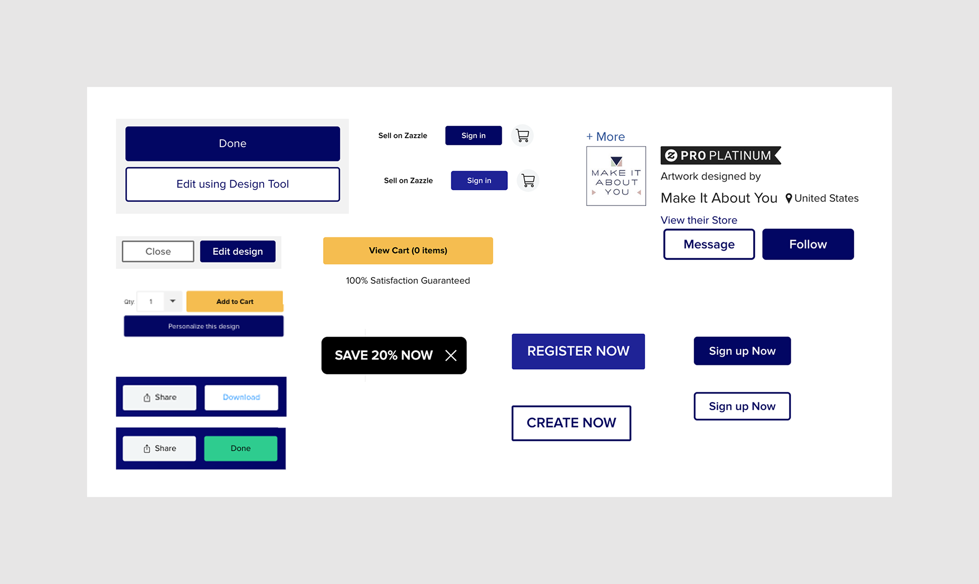
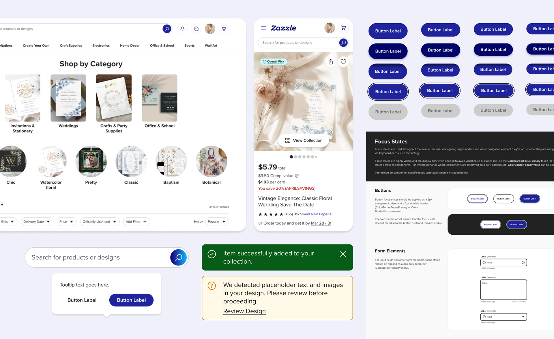
Just a snippet of the different button styles on Zazzle's website and Storybook library.
Challenges: Bridging Design Gaps and Optimizing Workflows
Zazzle faced significant hurdles, including:
- Absence of a Figma design system: This resulted in an inconsistent user experience, inaccessible design elements, and confusing patterns across the site.
- Outdated and tech debt-ridden Storybook UI library: Further contributing to inconsistencies and technical inefficiencies.
- Lack of an in-house design team: Product Managers, with varying levels of Figma and UX expertise, were responsible for all design execution, leading to inconsistencies and inefficiencies.
- Aggressive 10-week timeline: We were tasked with completing both discovery and design phases within this compressed period.
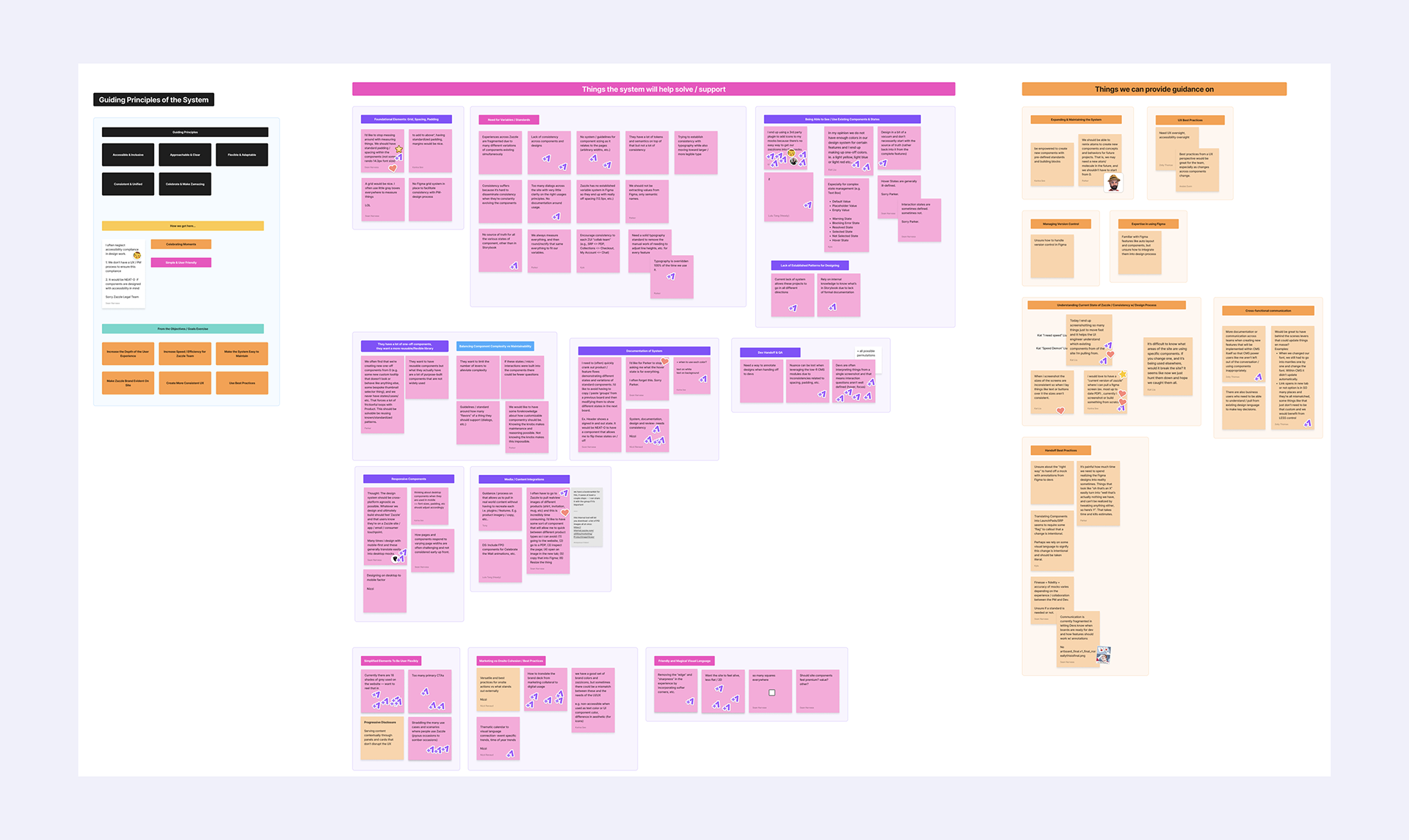
Post-workshop categorization in Figjam.
Discovery: Uncovering Needs and Shaping the Solution
To kick off the project, I co-facilitated a full-day, on-site workshop at Zazzle's San Francisco headquarters. During this session, we gathered invaluable input from our core stakeholder team, C-suite executives, and various departments.
In addition to the workshop, we conducted panel interviews with representatives from the key end-users of the system: Product Managers, UI Engineers, Brand Designers, and the Merchandising team.
I also spearheaded a comprehensive audit of Zazzle's existing website, Storybook library, and design files.
Based on the insights gathered from these activities, we compiled a detailed findings report outlining our assessments, key findings, and a recommended strategic approach for the design system.
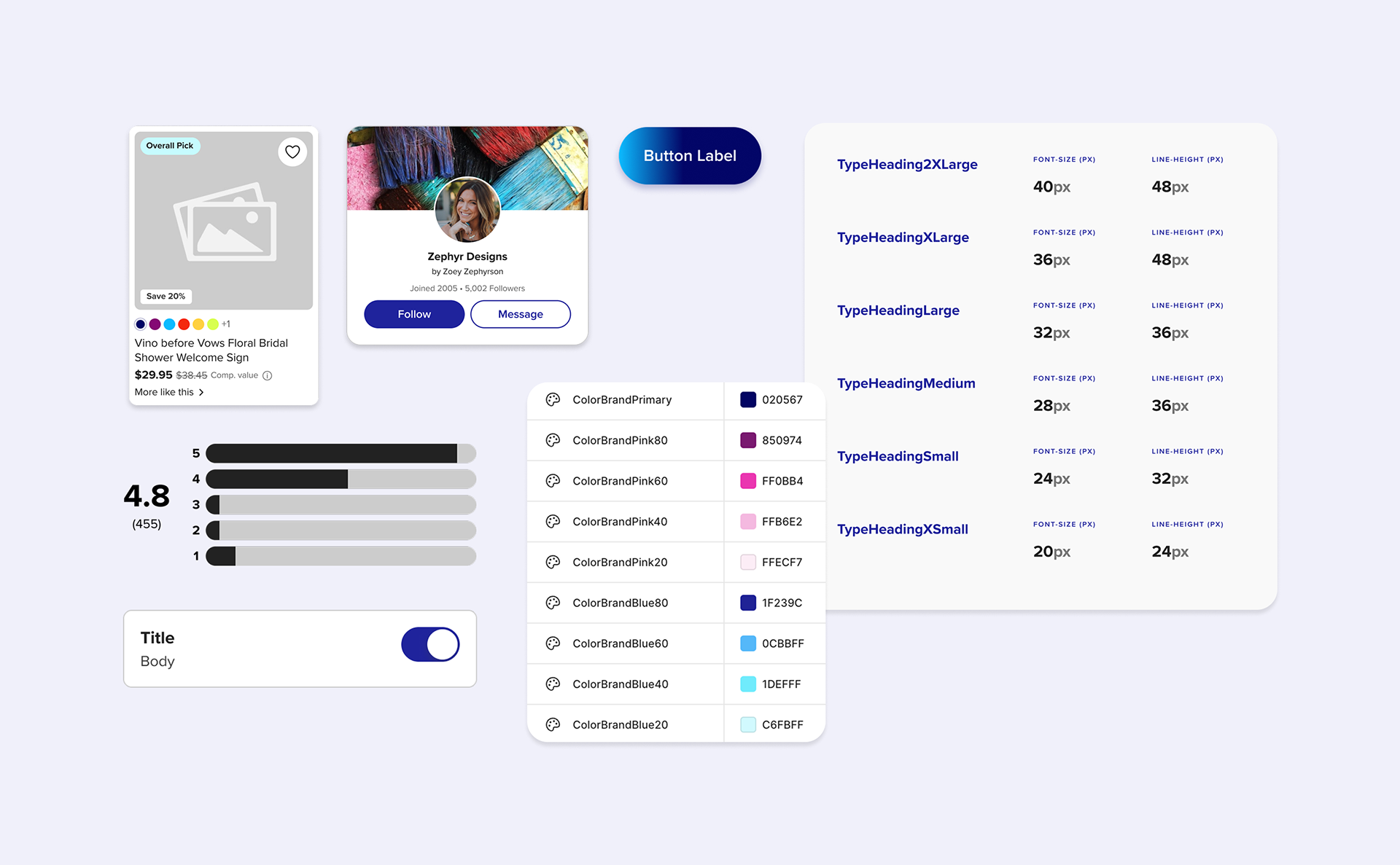
An excerpt of some of the components and documentation in the Zazzle Design System.
Building the Design System: Foundations for Scalability
Once the findings report was approved and we aligned on our recommended approach with the client, we began building the design system in Figma.
I advocated for and implemented the use of Figma variables to create scalable design tokens for color, spacing, corner radii, and other critical values. This approach significantly enhanced the system's usability and accessibility, especially for non-designers.
To ensure comprehensive understanding and adoption, we developed in-file documentation within Figma, providing users with all necessary context to navigate and leverage the system effectively.
Furthermore, we hosted regular "office hours" with the Zazzle team to demo the system, address questions, and onboard them to key Figma features, fostering a smooth transition.
Empowering Non-Designers with Modularity & Self-Documenting Components
To maximize usability for all team members regardless of their Figma proficiency, I championed the incorporation of modularity into our components.
A prime example of this modular approach can be seen in the Dialog and Sheet components, which leverage a self-documenting, swappable sub-component. This allows users to easily swap out content at the instance level for a set of standard content blocks (forms, input fields, media) or integrate custom local components.
This design significantly enhances adaptability and minimizes the need for detached components in design files, ensuring consistency and efficiency.
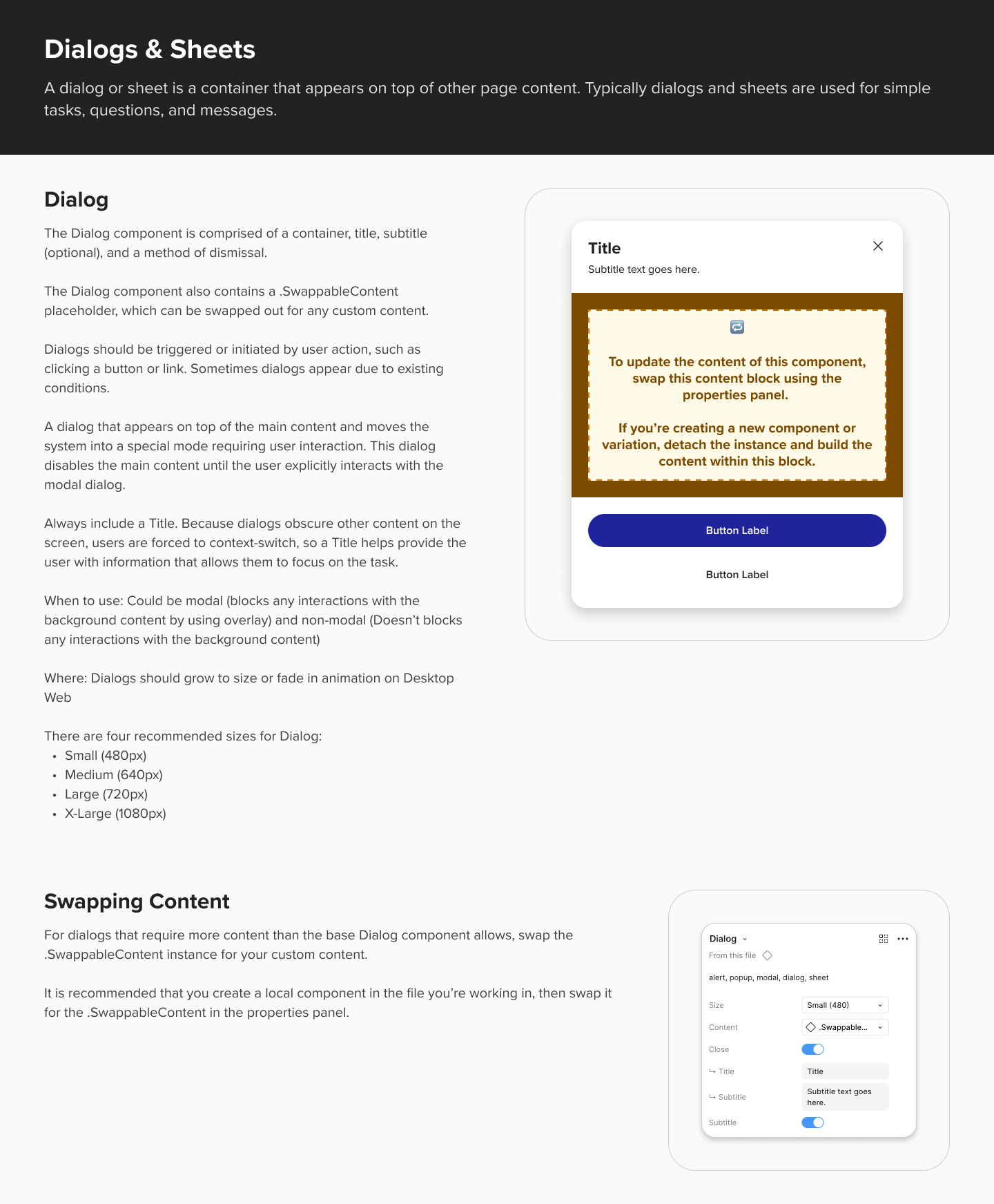
In-file documentation for the modular Dialog component.
Microinteractions: Adding Delight and Cohesion
Beyond delivering a responsive design system within a tight timeframe, our team also integrated microinteractions into many components.
While adding another layer of complexity, the inclusion of microinteractions allowed us to provide Zazzle with strong recommendations for cultivating a more cohesive and delightful on-site experience for both customers and creators.
I was responsible for creating many of the microinteractions showcased in the accompanying video.
Video showing some microinteractions in the card components.
Key Takeaways: Lessons Learned for Future Success
Defining and building a design system from scratch in just 10 weeks presented a significant challenge. While the compressed timeline was a client stipulation, in hindsight I would have prioritized more explicit expectation setting regarding the scope and possibilities within such a limited timeframe. This proactive approach would have showcased our team's design authority and expertise, setting the project up for even greater success.